
Branding that works as a system
We build brands grounded in clarity, structure, and thoughtful visual logic. Our approach combines design, engineering thinking, and technical precision to create identities that function as real tools—not just decoration.


For us, branding is a system that creates a clear, consistent, and distinctive presence for a product. We begin with research and strategy development — defining the audience, values, positioning, and unique selling proposition. Based on this foundation, we build the visual identity and design system, fully prepared for real-world use: from layouts and packaging to production files and implementation.
We combine artistic vision with engineering logic to ensure the brand is not only expressive and stable, but also stands out in the market and accurately reflects the company’s meaning and value to its audience.
-
Defining audiences, goals, and the conceptual foundation of the identity.
-
Creating names, messaging, and communication tone.
-
Logo design, color systems, typography, and compositional principles.
-
Building a flexible visual architecture that scales across all formats.
-
Clear instructions for applying the identity—from grids to print materials.
-
Packaging, labels, presentations, campaign assets, digital content.
-
Preparing files, managing color accuracy, testing materials, supervising print.
-
Developing visual structure for physical products, boxes, sets, and collections.
-
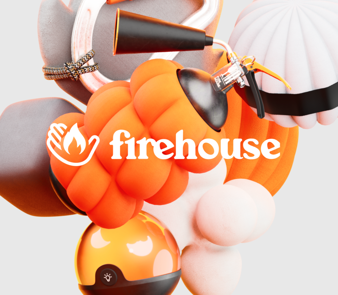
![Halloween-themed objects including plush pumpkins, a toy spray bottle with a pumpkin design, a glowing pumpkin-shaped light, and a ghost figure with the Firehouse logo overlaid.]()
Firehouse Social
-
![Collage of various color blocks with text in Russian and images of classical architectural columns and interiors, including information about a legal case and a law boutique rating in Russia.]()
Law Boutique
-
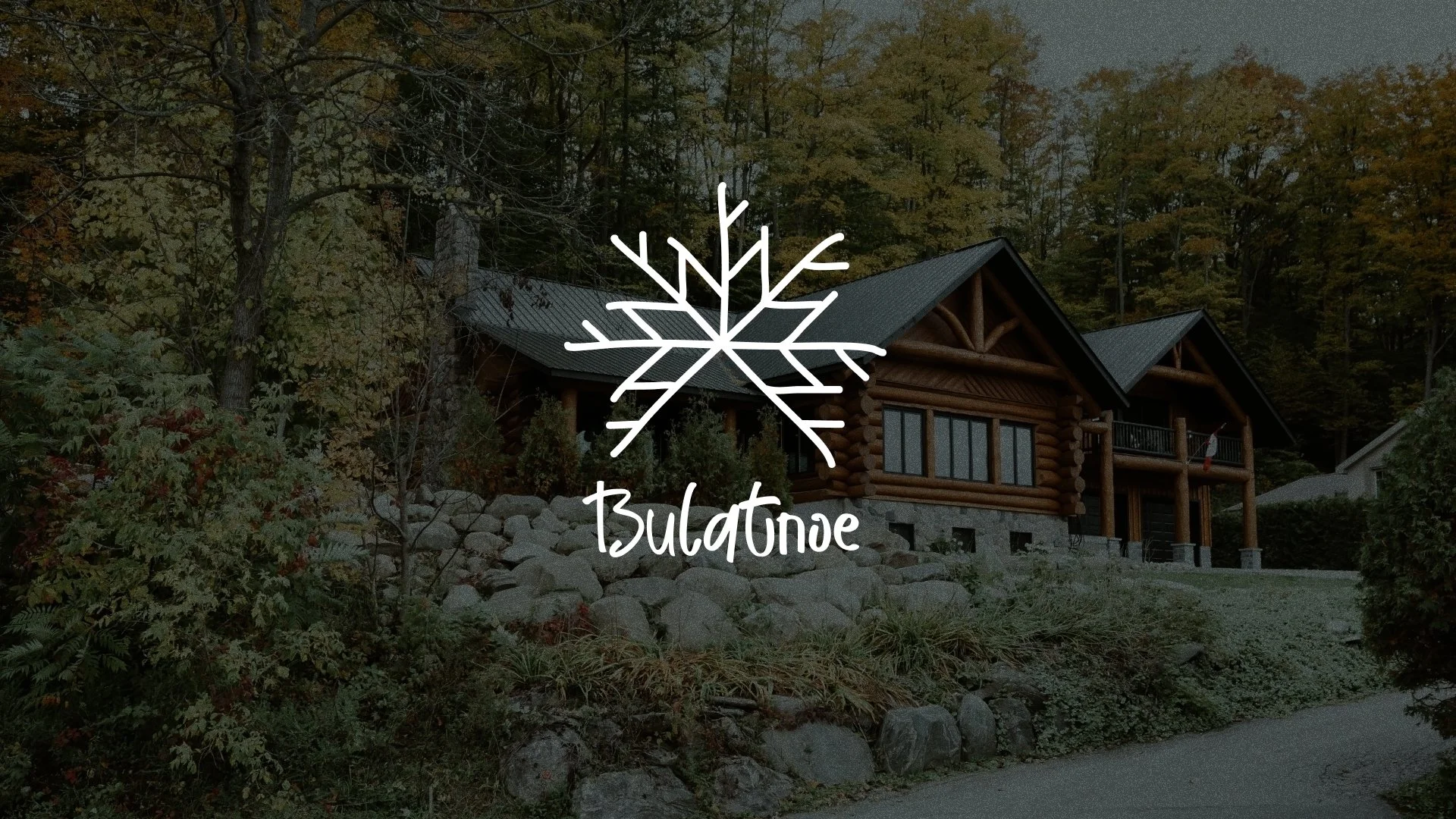
![A rustic log cabin with a green metal roof, surrounded by trees and rocks in a wooded area during fall. Overlay graphic of a snowflake with the word 'Bulletone' underneath.]()
Bulatnoe Hotel
-
![Three green disposable coffee cups with black and white illustrations of people, animals, and abstract designs, all bearing a logo that says 'Old Enough' in stylized text. The cups are stacked diagonally on a green background.]()
Restaurante Treatbond
-
![Collection of branding and office stationery items for Favorit Finance, including a brochure, business card, notebook, sticker, and a pen. All items feature a red and white color scheme with images of a red car and the company's logo.]()
Car insurance
-
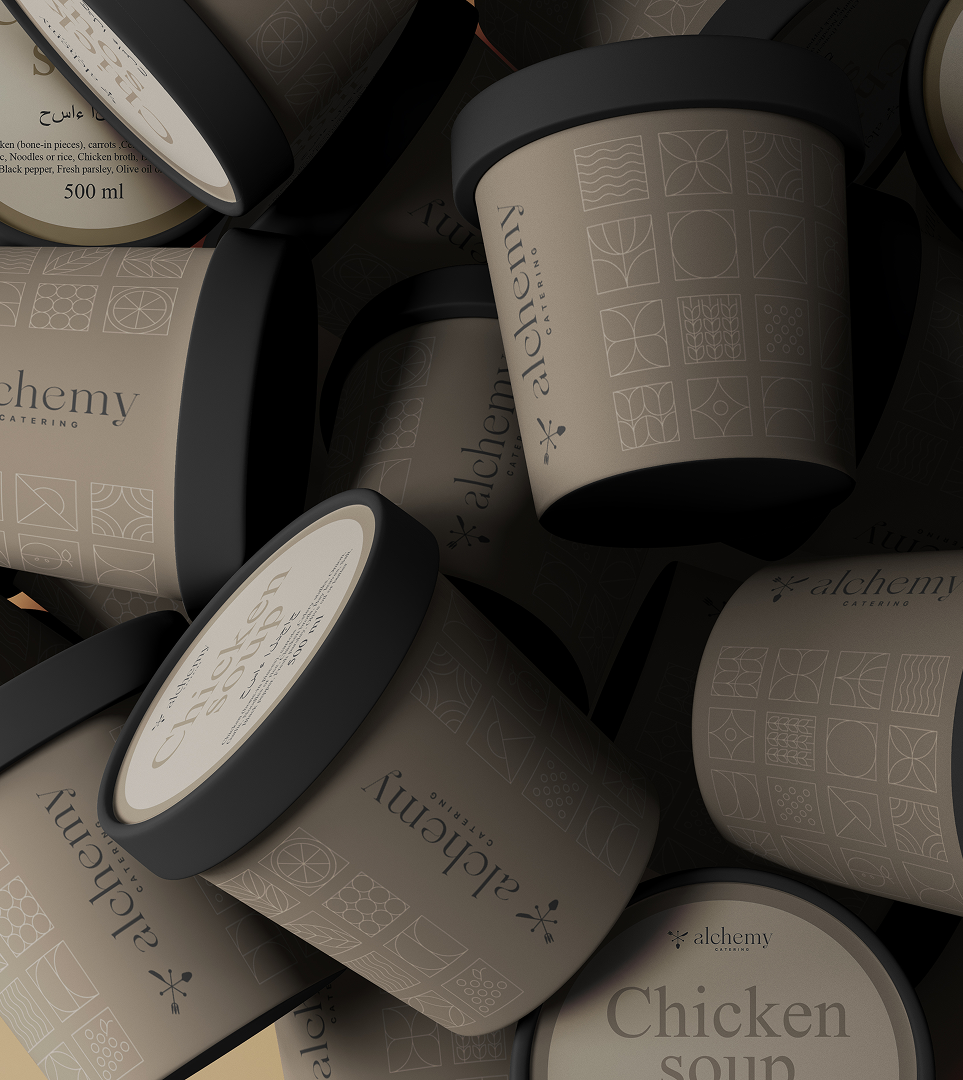
![Multiple cans of Chicken Soup from Alchemy Catering stacked together, with beige labels featuring geometric patterns and black lids.]()
Food delivery
-
![A robotic arm with a sleek black design, holding a small electronic component, with the Syntexpo logo overlayed on it.]()
Exhibition Stand Builder


-

We merge design and engineering
Visual solutions work better when built on logic and technical clarity.
-

We create systems, not one-off designs
An identity must be durable, scalable, and easy to implement.
-

We understand real production
We know how solutions behave not just on screen, but in a customer’s hands.
-
We treat branding as a product, not a presentation
Every brand must function—support communication, strengthen the product, and express its core idea.